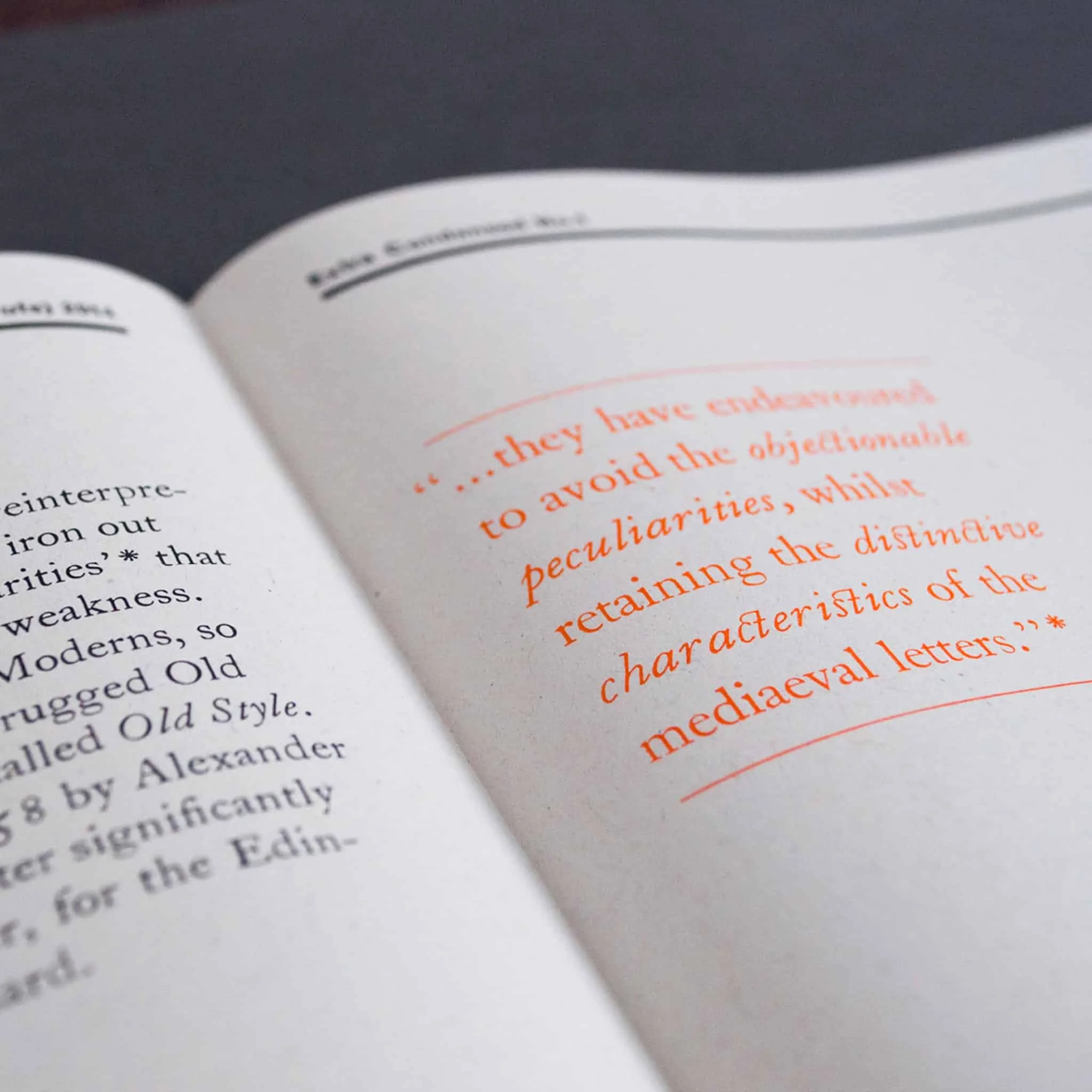
Extra Condensed No.1
Extra Condensed began as a challenge to ourselves: how can we create something new and relevant using only traditional materials and processes, and how can we make a piece of beautiful letterpress accessible and affordable to as many people as possible?
The answer was a newspaper.
The ambition became to produce an occasional publication dedicated to typography, graphic design and language – an ‘extra condensed’ journal in newspaper form – that would be available to anyone.
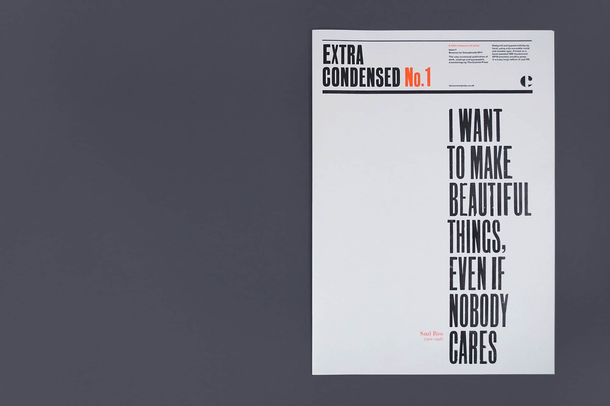
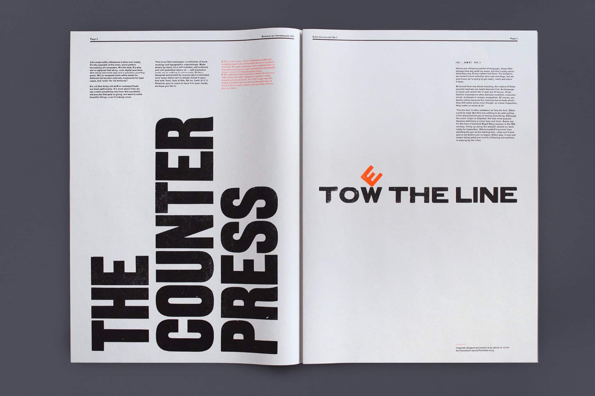
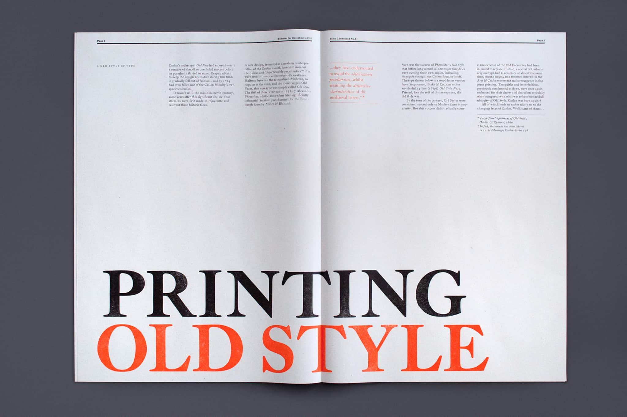
Issue No.1 features a quote from Saul Bass on the cover, the first in a series of often misheard or misunderstood idioms that have been explored typographically, a short essay on the history of the tittle (the little dot found on top of an ‘i’) and a specimen of the Monotype and Founder’s Caslon held at The Counter Press.
See our portfolio for more detail.
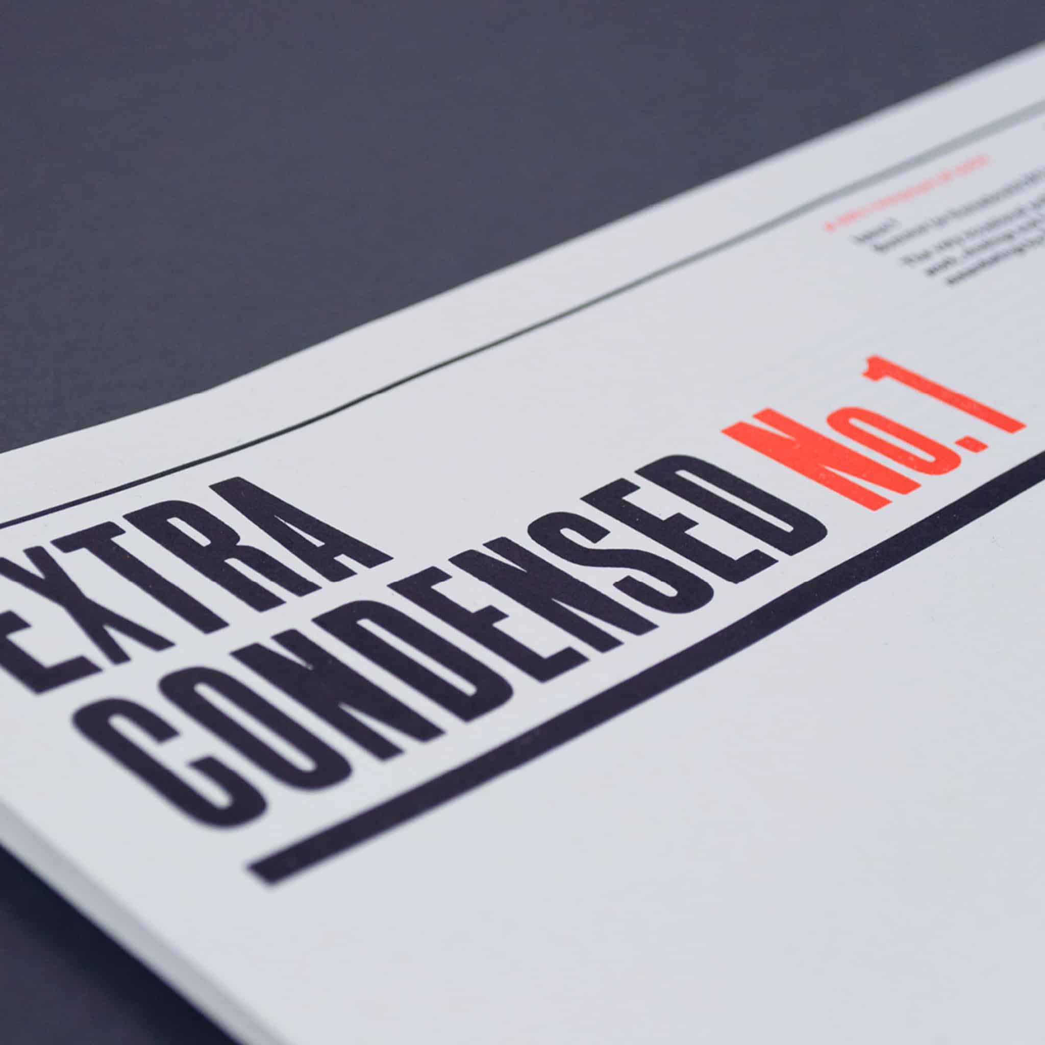
Written, designed, typeset and letterpress printed by hand in black and bright orange, in a limited edition of 150. Each issue comes folded in a custom printed envelope.
We have only a few rare copies left from the first issue.
—
Edition of 150
8 pages
304mm x 431mm
A note on shipping
Prices exclude postage and packing—which will be added at the checkout—and we’ve done our best to keep these costs as low as possible. Thanks to Brexit, if you are buying from outside the UK, you may also incur import duty or taxes, which we have no control over. If you have any questions or problems, please get in touch and we’ll do our best to work it out.
Selected spreads
