The Counter Press is a creative practice concerned with fine typographic design and printed material. Using only traditional wood and metal type — composed, arranged and letterpress printed by hand — it is a contemporary exploration of this centuries-old craft through the design and production of fine press books, broadsides, and other limited edition printed matter.
Inspired by a love of words and strong ideas, the aim of the press is to preserve the skills and materials of traditional handset typography and fine printing, while developing and promoting its relevance in a contemporary context. It is a pursuit not driven by nostalgia but by a belief that these historic materials can produce work that is as relevant as it is beautiful.
The press was founded and is run by Elizabeth Ellis and David Marshall.
WORKSHOP
Based between the cultural and historic cities of Bristol and Bath, the workshop is built around a unique collection of wood and metal type, and a selection of traditional printing presses.
PRESSES
All of our work is produced on our collection of vintage printing presses, all operated by hand (and sometimes foot). These include two precision proofing presses in the form of a US built Vandercook SP-20 and a German built Grafix GN1X, alongside a 1934 Arab foolscap folio treadle, a Farley galley press, and several smaller table-top platens.
Type collection
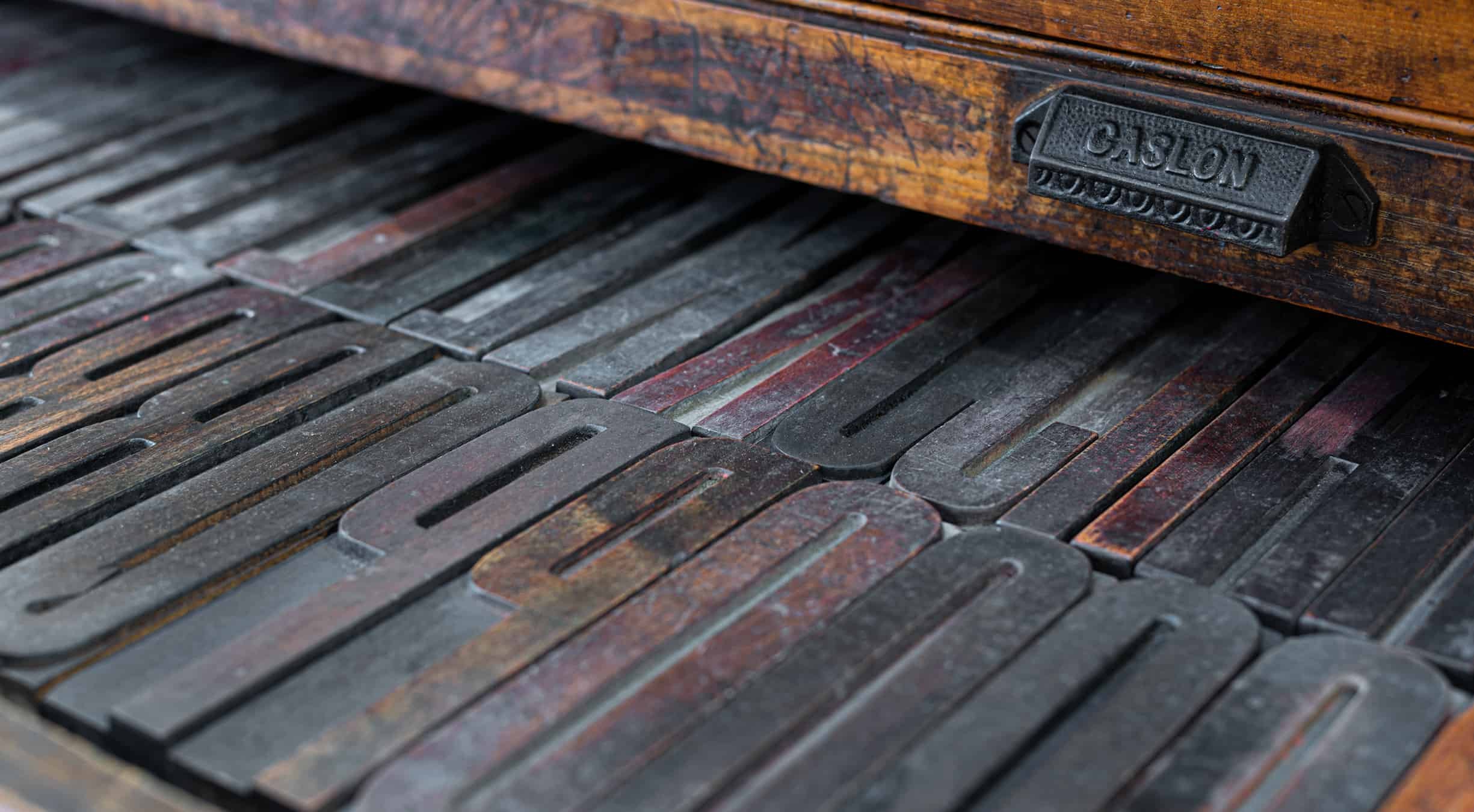
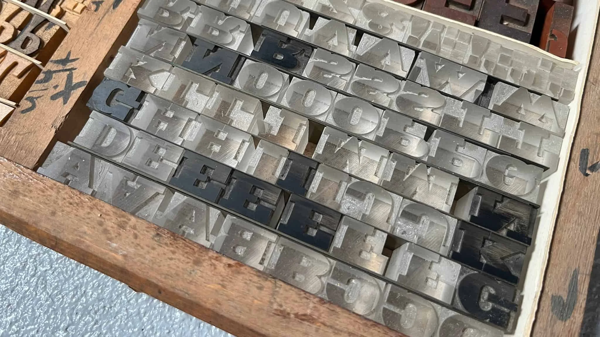
We work exclusively, often painstakingly, with traditional hand set moveable type. Every character, full point and space is composed and arranged entirely by hand. Our collection includes a large range of wood letter as well as metal type in both founders and Monotype cast as founts.
The Desmond Jeffery Collection AT THE COUNTER PRESS
We are also honoured to hold the remaining type collection of the late Desmond Jeffery, an eminent typographer, printer and educator of the 50s and 60s. A contemporary and friend of Anthony Froshaug, he was one of the leading practitioners of modernist typography in Britain at the time. The collection is made up exclusively of rare founders type from both the UK and Europe, including Romulus and Romanée by Jan Van Krimpen for Enschedé, Diethelm by Walter Diethelm for the Haas foundry, as well as several founts of original Neue Haas Grotesk.
An overview
Anglo-American
Antique No.6
Bodoni
Caslon
Garamond
Lutetia
Modern No.20
Monotype Grot 215 & 216
SB&Co Condensed Sans Serif No.7
Walbaum
—
Didot
Diethelm
Neue Haas
Normal Grotesk
Romanée
Romulus
Schadow
—
Wood letter
4-line (48pt) to 40-line (480pt)
In the press
BP&O
Creative Boom
Creative Review
Design Week
Eye Magazine
It’s Nice That
People of Print
Type Token
Under Consideration
Visuelle
in print
Nice to Meet You, Victionary
People of Print
Typograph: Journal
YCN Annual
In collaboration
Design Bridge
Derwent, London
Fontsmith
L’Atypique Cidre
MidCentury Modern Magazine
Monotype
Royal College of Art
Secret 7”
St Bride Library
Type Archive
talks
St Bride Memorial Lecture
Glug Birmingham
Oxford Guild of Printers
Leeds Print Festival
Outside of the press, we run Counter Studio – a brand and design consultancy that has the same meticulous attention to craft and thoughtful approach to design, but uses more modern means (most of the time).


