The Desmond Jeffery type collection
We recently finished building and moving into our new workshop: setting everything up just as we wanted it, we had (almost) everything we needed and everything was in its place. There was absolutely no more space for anything else. Nothing. No more moving heavy old stuff about, we were done. Finished at last…
We should’ve known, as letterpress printers that’s never true…
Out of the blue an email arrived: ‘we have some type we need to find a new home for, are you interested?’
The type in question was the complete remaining type collection of the late, great Desmond Jeffery, which had been housed at the Type Archive for the last 20 or so years. How could we say no!?
We first encountered the collection some years ago, while running workshops at the Type Archive. We were creating a poster to promote the workshops and as we hunted through the cabinets and cabinets of type, some cases in particular caught our eye, these were filled with more unusual type—mostly founders’ type from Haas and Enschede´—and these turned out to be Desmond’s.
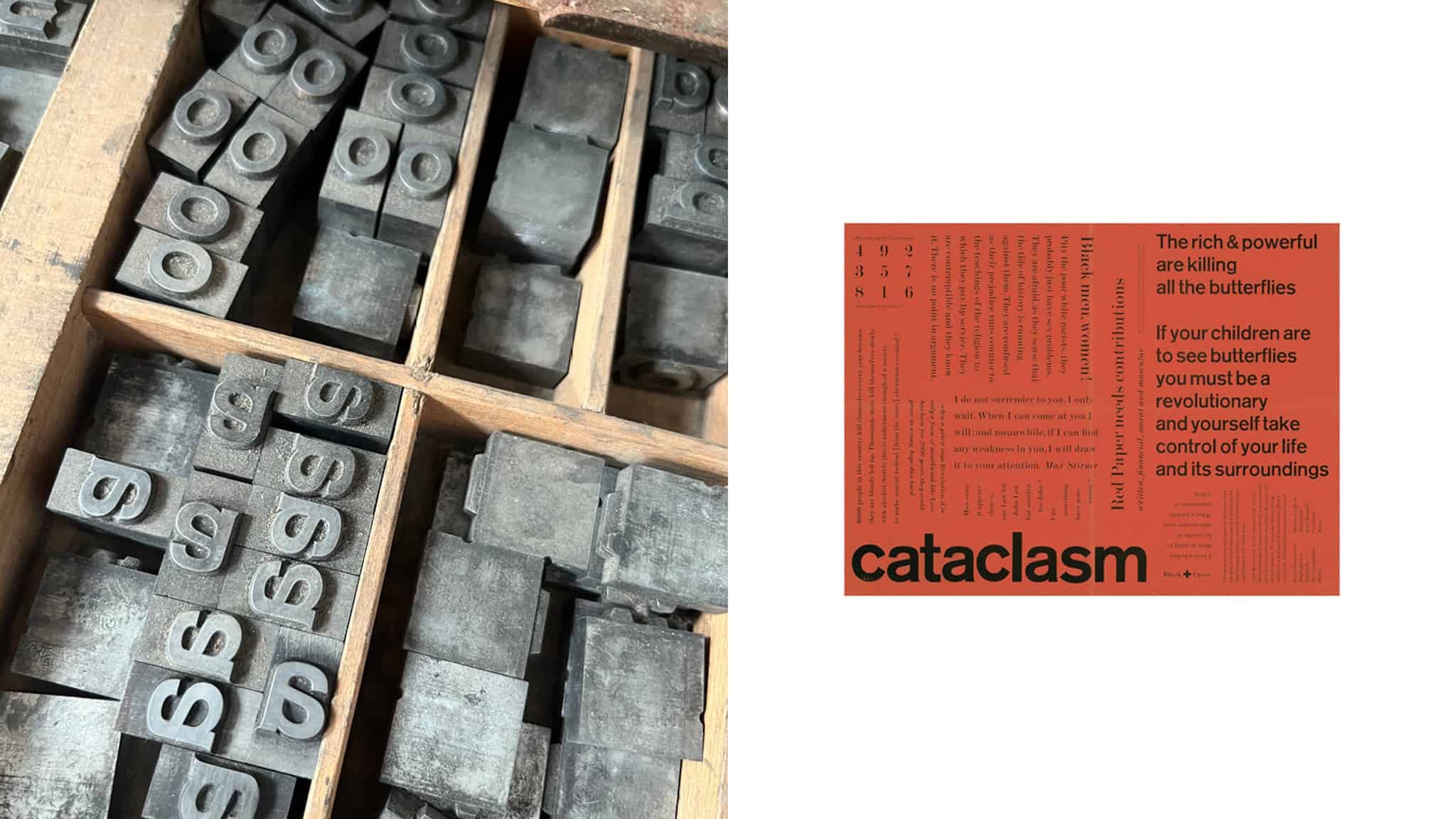
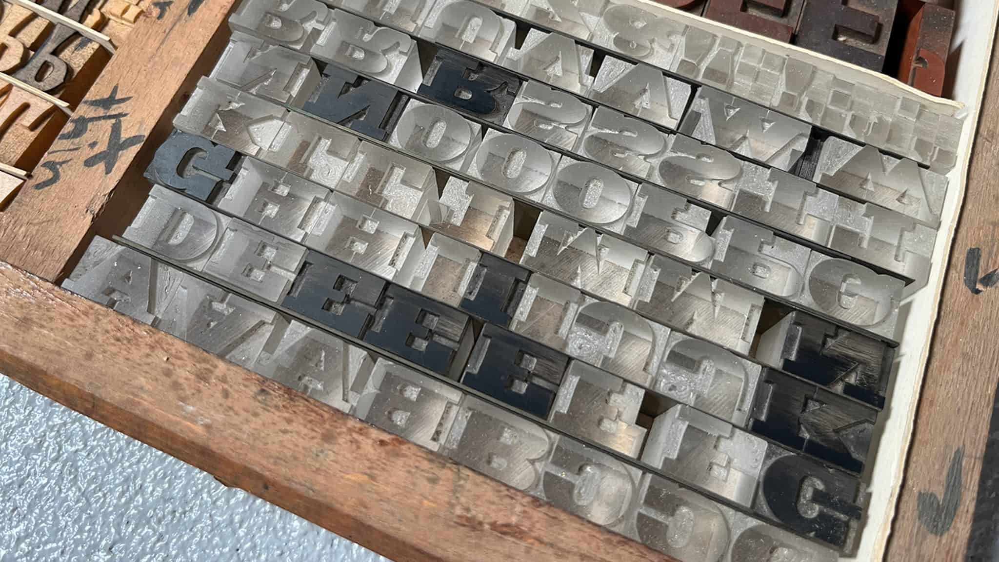
36pt Diethelm from Haas
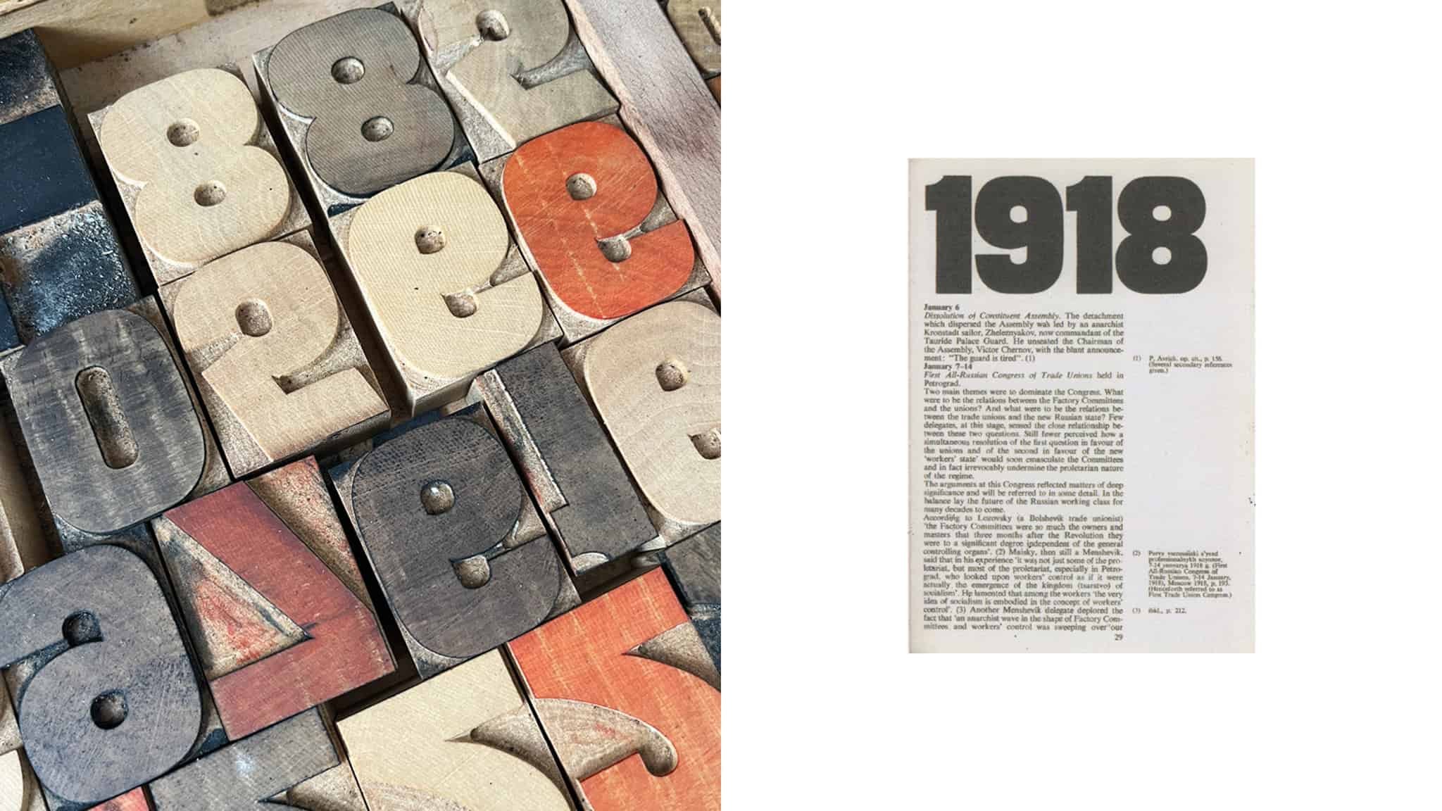
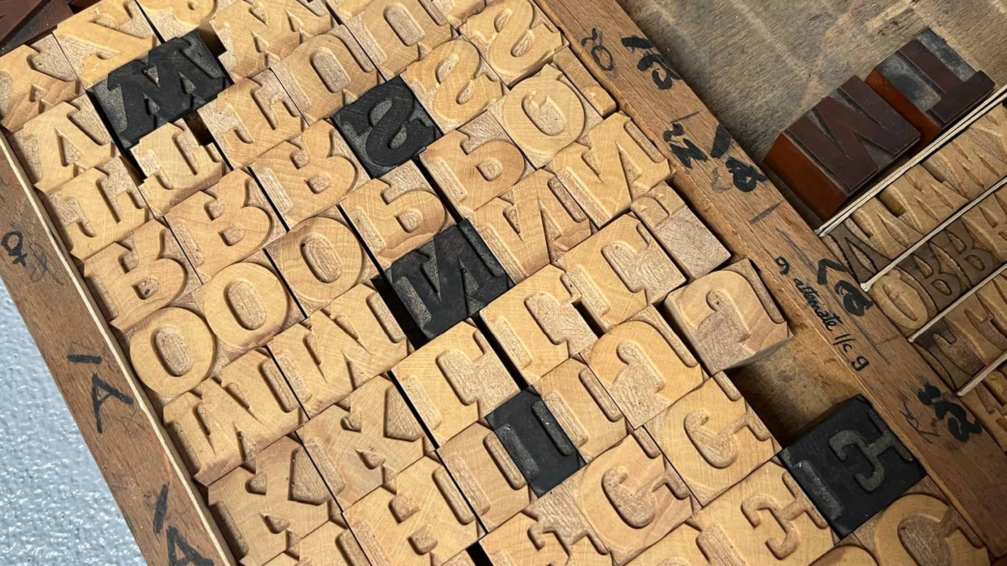
48pt Modern No.20 from Stephenson Blake
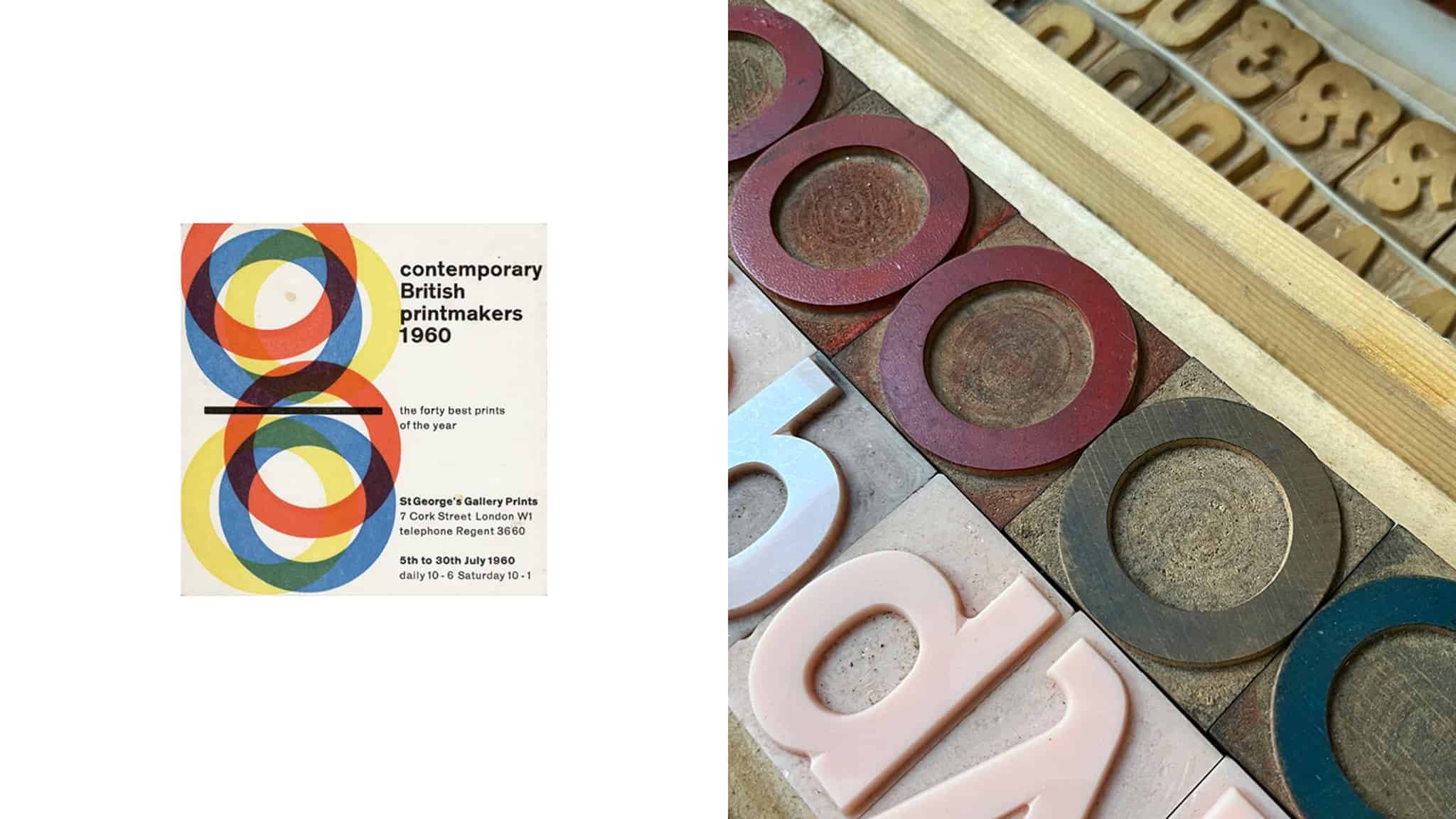
If you’re not familiar with Desmond Jeffery (and it’s likely you aren’t, his work sadly doesn’t get quite the widespread recognition it deserves), he was a letterpress printer and teacher of typography. He began printing in 1950s London, where he met Anthony Froshaug and discovered European design. He developed a taste for typefaces from Europe, importing Futura from Bauer and Berthold’s Akzidenz Grotesk (or Standard as it was called in the UK) early on, then later Normal Grotesk, Neue Haas and Diethelm from Haas, Romanée and Romulus from Enschedé, Schadow from Weber – all with the exception of Futura still remain in this collection.
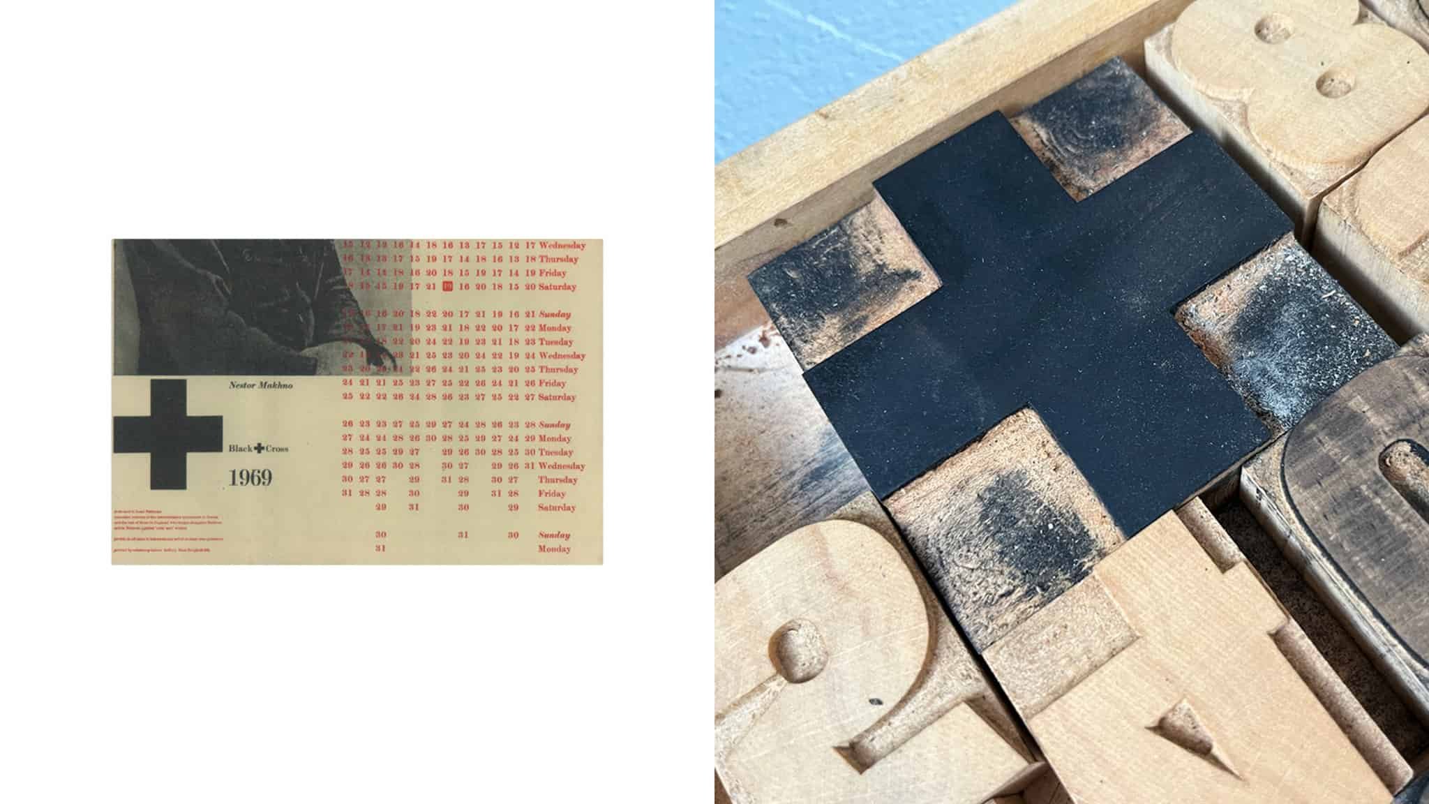
Desmond worked intuitively, working straight into the composting stick, never sketching up a design first —in fact, he rejected being called a designer: his view was that designers talked about doing, whereas he did it. He mainly produced work for galleries, type-founders, architects. Left-leaning political organisations, breweries, restaurants and cafes, yet most of this was ephemeral very few pieces have survived. Those that have show his beautifully considered Modernist approach to layout and print. And although he didn’t call himself a designer, he has become one of our favourites over the years.
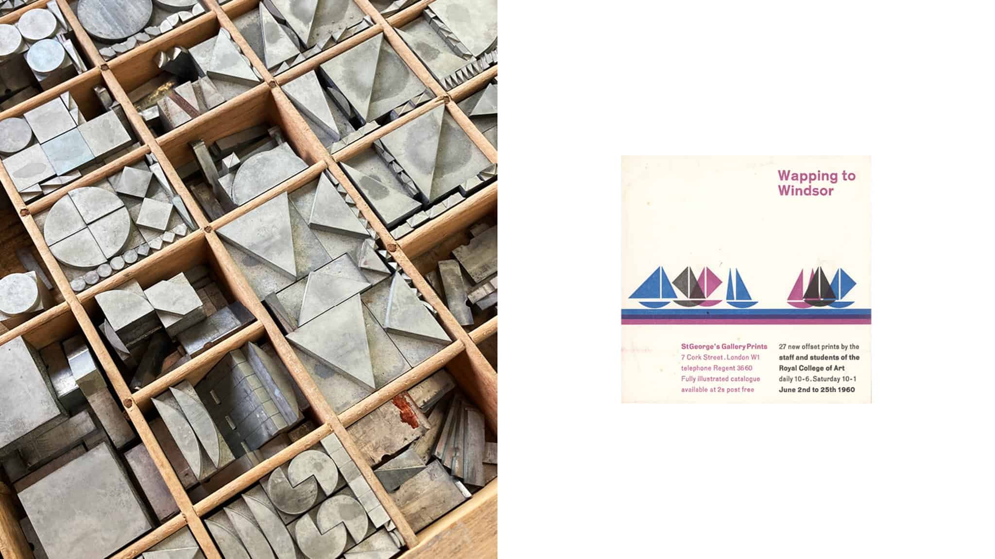
To now have Desmond’s type collection at The Counter Press is both humbling and exciting. We have inherited four cabinets filled with both British and European founders’ type, some of which is incredibly rare, as well as poster type from DeLittle among others.
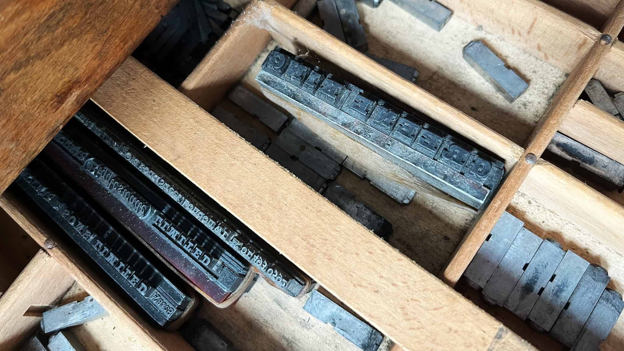
It’s been fascinating getting to know this new collection and what we now have in the workshop, and being able to compare the physical type with Desmond’s printed pieces—something that we’ve never been able to do with any of our type before. To be able to see the printed work and the very type that was used to produce it is a very rare thing. And even when we don’t have a printed piece to compare the type to, the ink still left on the type gives away what it was used for—most often wine lists!
We’re looking forward to putting our own ink on the type and giving the collection a new lease of life. And it’s with many thanks to Richard Ardagh at the Type Archive and Sally Jeffery for allowing us to become custodians of Desmond’s type, as well as helping us get to know him a little more.
(We set the poster at the Type Archive in Desmond’s type, Diethelm Antiqua, which we loved so much we invested in buying our own fonts earlier this year. And now we have come full circle: adding that original Diethelm of Desmonds to our own.)


