Wynkyn de Worde Society
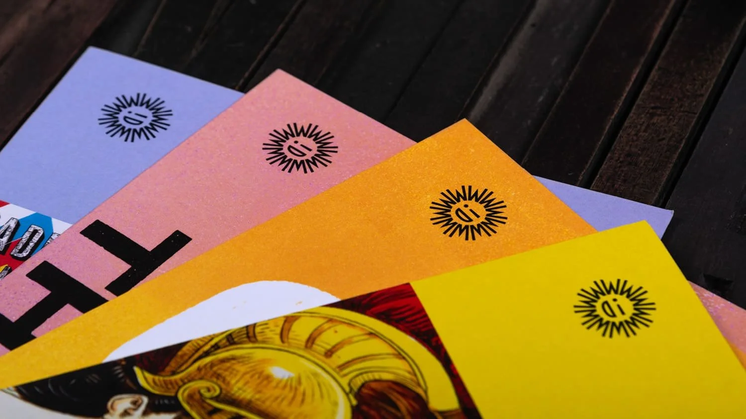
Named after the ‘Father of Fleet Street’, the Wynkyn de Worde Society was founded in 1957 to be ‘dedicated to excellence in all forms of printing’, with a membership covering a wide range of backgrounds from design and typography to production and publishing.
As time and technology has moved on, the Wynkyn de Worde Society has always looked beyond the ever-changing techniques of the world of printing to the wider spheres of communication. Our challenge as honorary designers in 2023 was to update the identity to reflect this more contemporary and forward-looking vision.
For a society with words and communication at its heart, and typography as a thread that binds it all together, the solution for the new identity was to embrace this fundamental truth: a symbol created from letters and a visual system that heroes typography and written language.
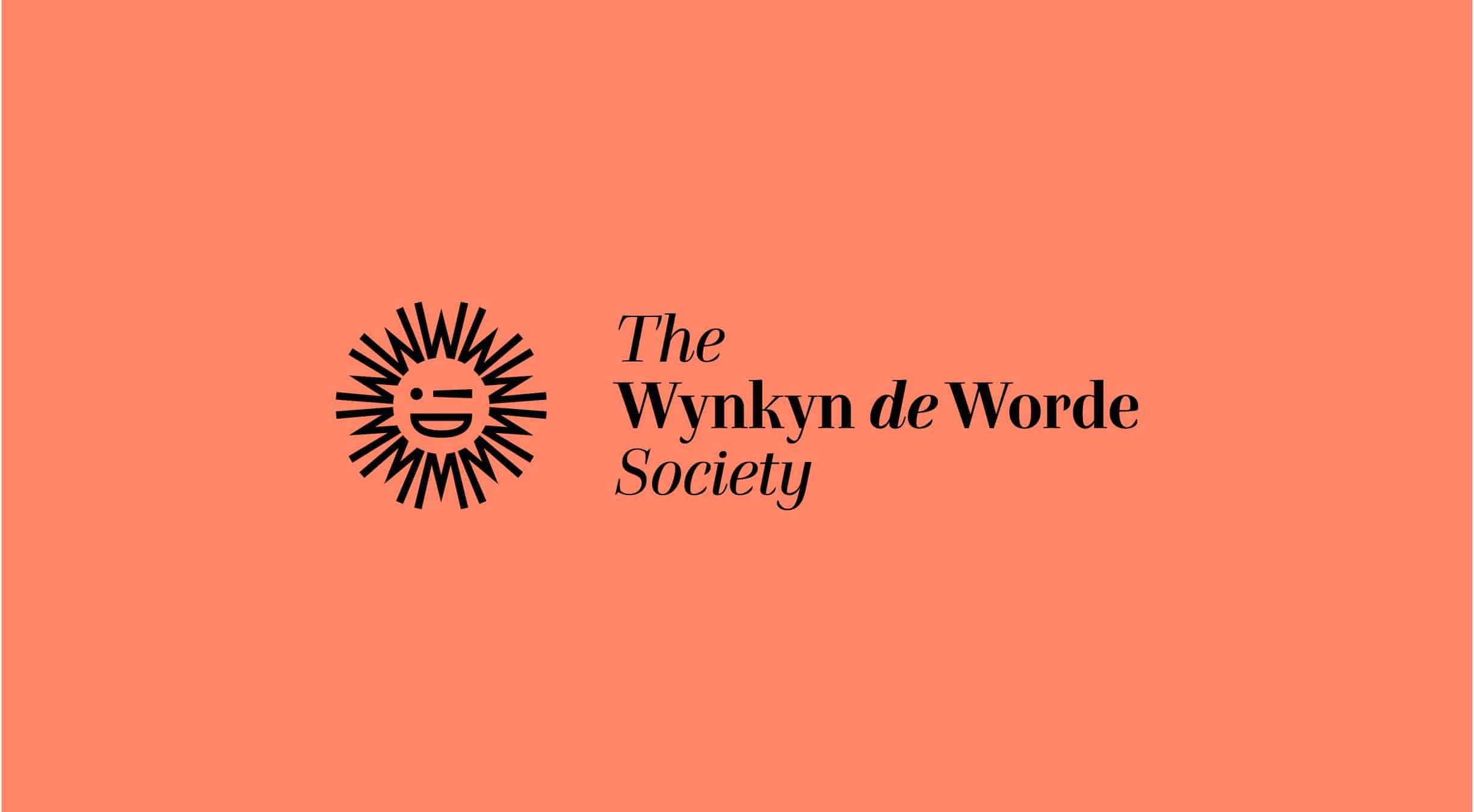
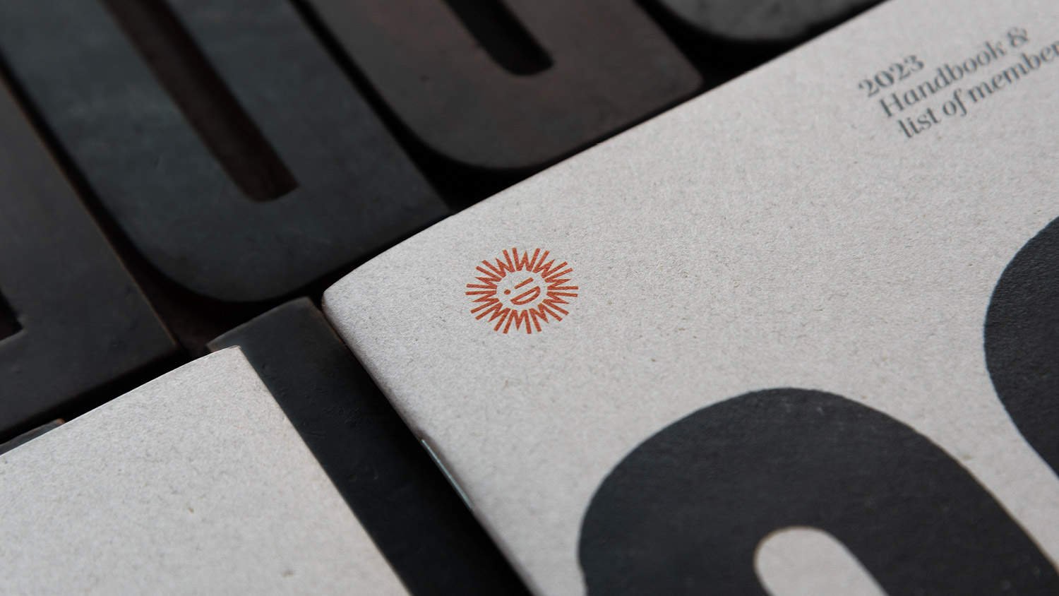
The new symbol takes the society’s initials, WDW, which have been carefully drawn to form an iconic smiling sun, with an exclamation mark adding a playful wink. Or should that be a wynk?
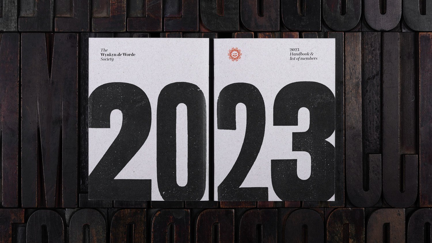
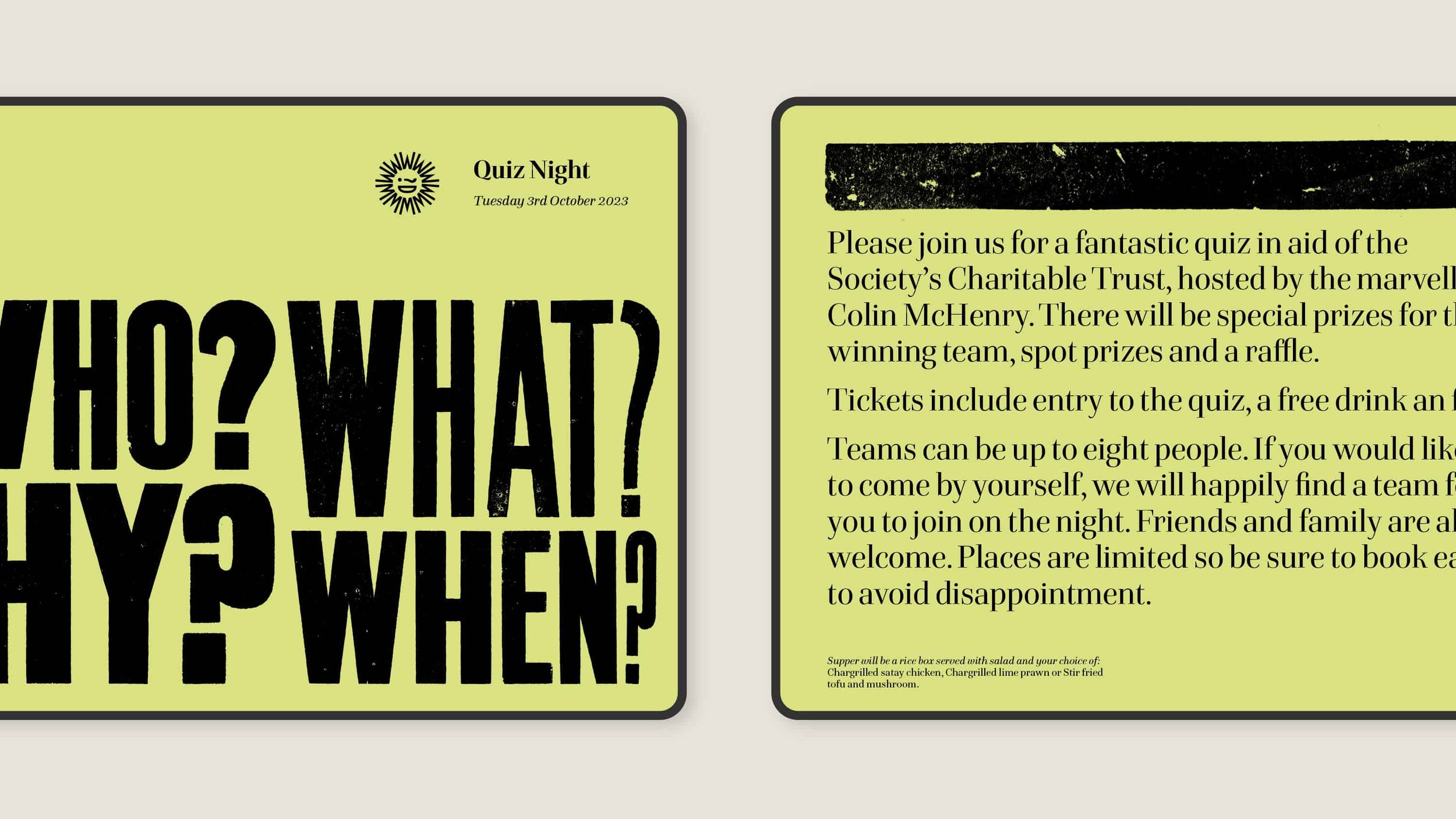
As a society that loves print, printed pieces play a large role in the communications to members. We introduced an identity system to be used across stationery, members’ handbook and event invites, which balanced crisp, modern typography and a strong graphic structure, with expressive letterpress printed type.
The wood type used throughout was curated from our collection and printed by hand in our workshop, and then digitised to create unique pieces of typography. There are also a handful of printers’ fists and arrows to add little flourishes to the Members’ handbook.
The result is a distinctive and cohesive identity system, with an expressive, playful and colourful flexibility, which can adapt to different situations and messages, while remaining true to itself and the underlying principles of print and publishing.
If you’d like to join the ranks, or find out more, head over to the Wynkyn de Worde Society website.
COLOPHON
Bespoke symbol, visual identity and overall design created at Counter Studio, with wood type letterpress printed and scanned at The Counter Press.
Art direction—Alistair Hall, We Made This
—
Wood type—Various wood letter from our collection
Metal type—A handful of printers’ fists and arrows
Digital type—Hawkland by Jeremy Tankard
—
Paper—Fenner
Print—Typecast
