New type? What a load of gibberish

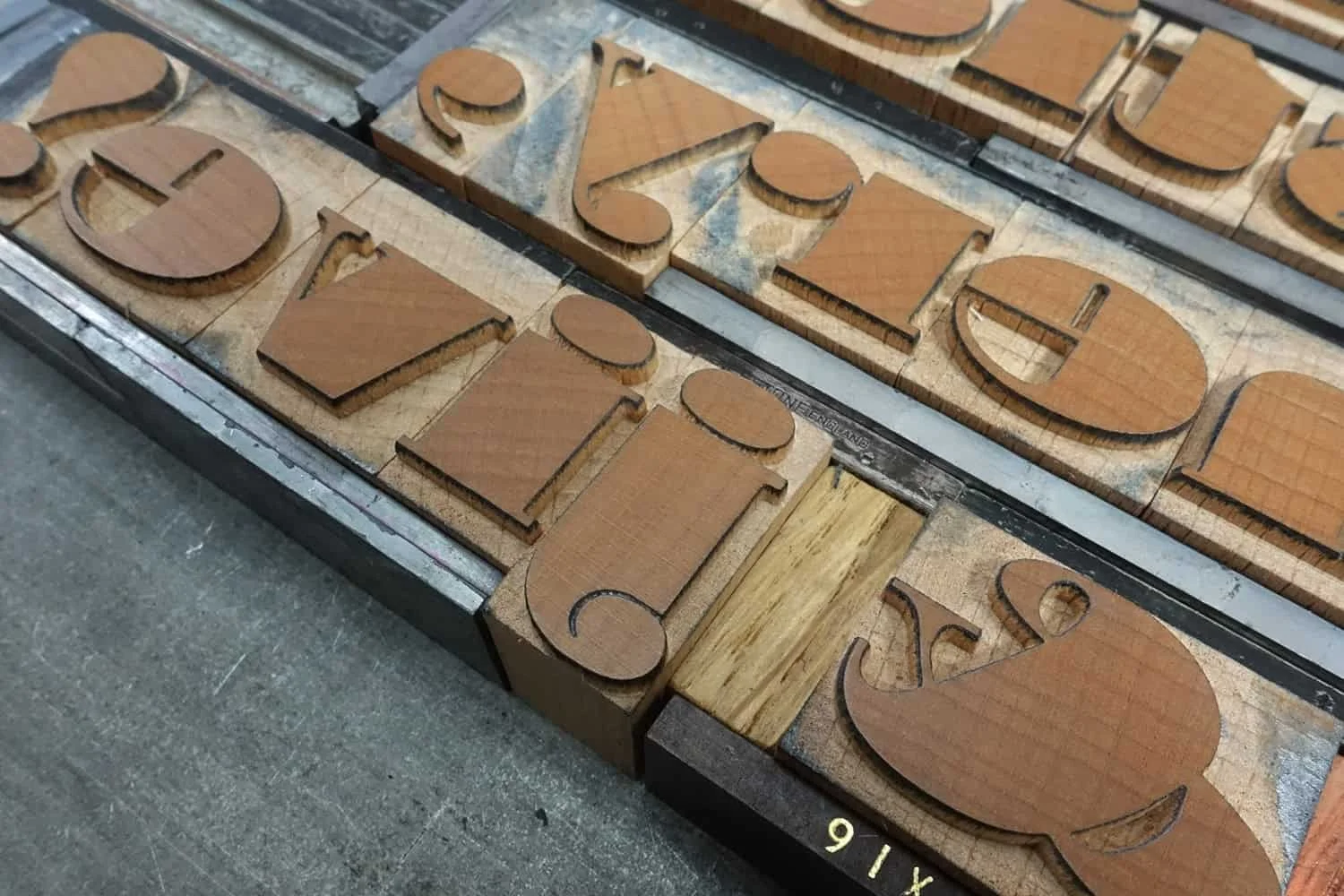
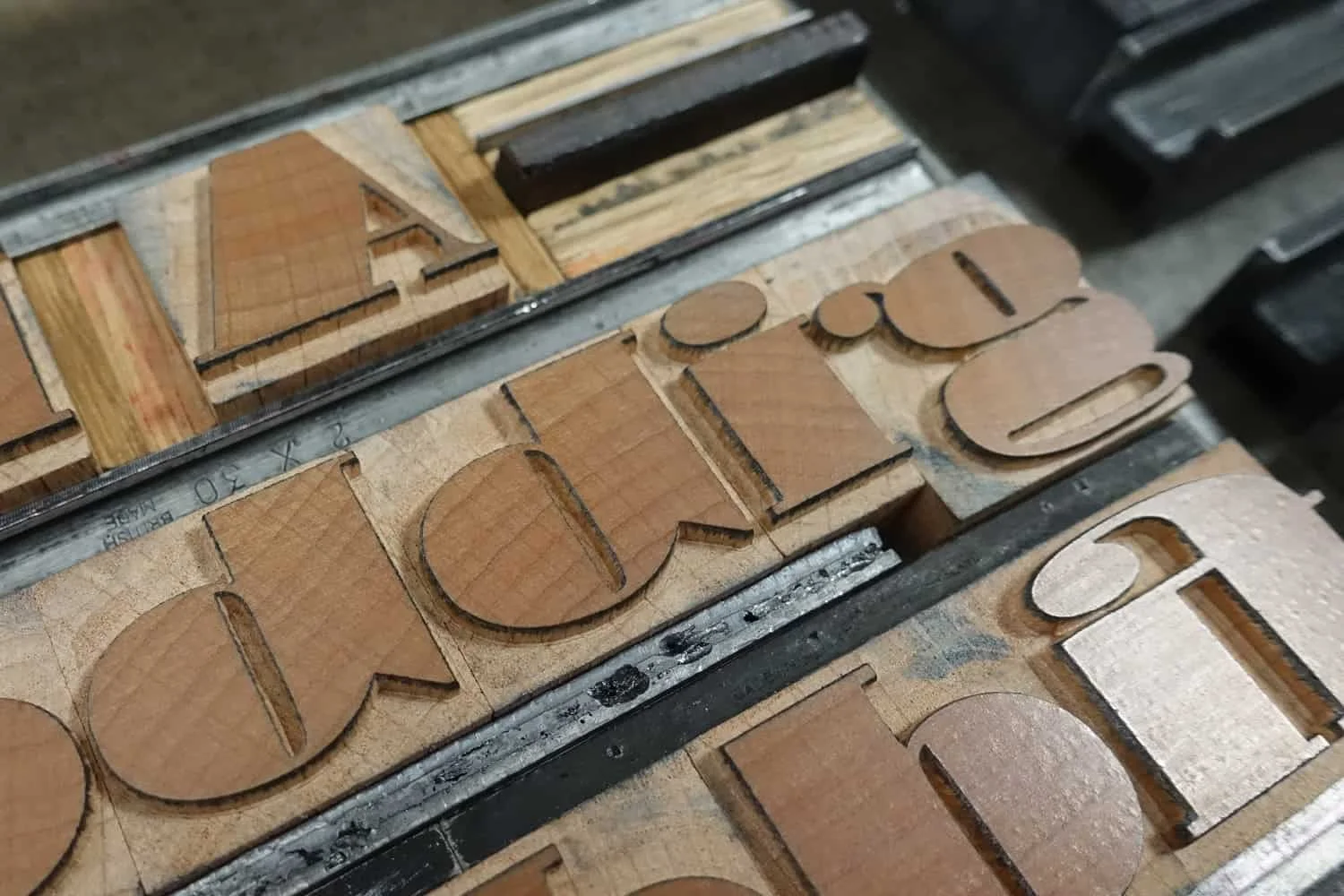
Over the years we have built up a carefully curated collection of antique wood type that covers a broad range of styles and sizes. It is somewhat skewed towards the humble grot – a firm favourite of ours – as serifs have always seemed harder to come by. Those we have stretch from sharp Latins and blunt slabs, to the classic Old Styles. But the right Fat Face has always alluded us. So we decided to make our own… With some help.
In conversation with type designer Paul Barnes, we explored the idea of creating a wide Fat Face for wood type; a font that celebrated the bold, brash extremes of a serif, and pushed the boundaries of what could be achieved in wood, but without breaking them.
Using Commercial Type’s Isambard No.2 as the basis—which was itself based on the historical forms of a fat face—Paul extended the proportion of his characters from expanded to obscene and back again. Although tempting to push the letters to their maximum, the desire to use the type as text in smaller formats meant that function drove the final form. The resulting font was created at 6-line (72pt), with the characters each stretching just as wide as was comfortable.
As with any wood type being translated from a digital format, allowances in design have to made for the method of production. Kerns, or overhangs, on letters are a particular issue in making wood type, which led to creating unique versions of the lowercase f and j, which now curl in on themselves. The type has some challenging narrow counters and thin lines to contended with, yet it was expertly cut by Type High Design.
For the font’s first outing, we have created a piece of puff and nonsense, simply to showcase some of our favourite – as well as the most fanciful – characters in this new wood type font. To match the playfulness of the letterforms, we chose a selection of synonyms for nonsense, most of which are complete gibberish.
The print has been hand set and letterpress printed in two colours using a Grafix GX1N proofing press on Zerkall Ingres paper.
COLOPHON
Edition of 32.5 (more nonsense! Although the .5 is available at special request)
Broadside
480mm x 210mm
—
6-line Isambard No.2 Extended
Design
Paul Barnes / Commercial Type
Production
Type High Design
12pt foundry Neue Haas
—
Zerkall Ingres


